Visual Guidelines
The combination of visual elements and our voice and tone works together to reflect our core values — professionalism, collaboration, and innovation. Together they create a cohesive and trustworthy presence where form and function align to inspire confidence and connection.
Spacing
Spacing plays a vital role in maintaining balance, clarity, and visual hierarchy when combining elements in brand assets. It ensures that each component has room to breathe, enhancing readability and focus while guiding the viewer’s attention to the most important information.
Proper spacing works in harmony with other design elements — color, typography, and imagery — to establish a sense of structure and cohesion.

By using consistent and thoughtful spacing, we create layouts that are visually appealing, organized, and reflective of Enara’s commitment to excellence and attention to detail.
Illustrations
Illustrations are a key component of Enara’s visual identity, adding warmth, creativity, and approachability to our brand.
They should be clean, modern, and consistent in style, using colors and forms that align with the overall visual guidelines. Illustrations help simplify complex ideas, engage audiences, and bring an emotional connection to our messaging.
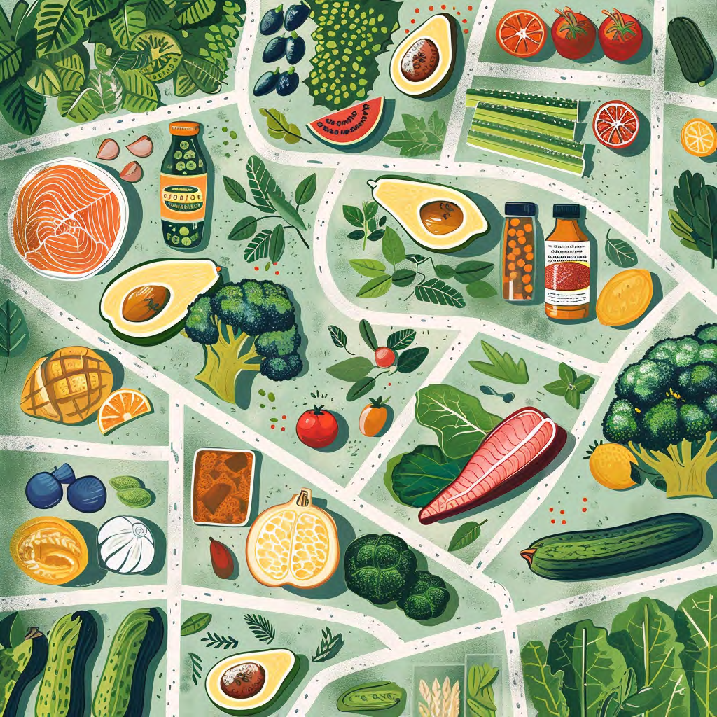
Illustration library


Imagery
Imagery is a powerful tool that brings Enara’s brand to life. Our imagery should feel authentic, approachable, and inspiring, reflecting the human side of health transformations and the trust we build with our partners.
Whether showcasing individuals on their wellness journeys or highlighting clinical expertise, visuals should evoke positivity and confidence.
Consistent use of color, composition, and tone ensures that imagery works seamlessly with other design elements, creating a cohesive and impactful brand presence.
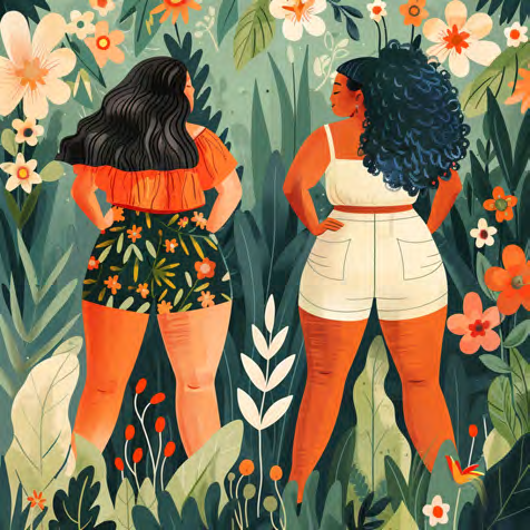
People imagery


Clinic imagery


Iconography
Iconography is an essential element of Enara’s visual identity, providing clarity, functionality, and a touch of personality to our communications.
Icons should be simple, clean, and modern — easily recognizable and aligned with our professional yet approachable brand style. They should work in harmony with typography, color, and spacing to enhance usability and guide users intuitively.
Rules
- Consistency: Maintain consistent style, weight, and proportion across all icons.
- Color: Use brand colors. Do not introduce colors outside the palette.
- Size: Design icons to remain legible at small sizes. Do not add complex detail that disappears at 24px or below.
- Filled vs. outline: Choose one style and apply it consistently within a single context (do not mix filled and outline icons in the same UI).